
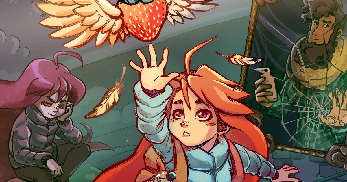
Cover image: Celeste artwork © Maddy Makes Games. Source: official Celeste website.
Shrink your game logo until it is about the size of a store thumbnail. Can someone who has never seen your game read the title without leaning closer?
That is a useful first test for game logo design. A title can look impressive across a large monitor and lose its identity inside a crowded storefront. Fine details disappear. Letter spacing collapses. A dramatic background swallows the name.
This guide walks through a practical way to design a game title that communicates its genre, survives smaller layouts, and gives your marketing a consistent visual starting point.
Start with the game’s promise
Before opening a font menu, write one sentence describing the experience you want players to expect.
“A tense expedition through an abandoned space station” gives you more direction than “a cool sci-fi logo.” The first suggests isolation, controlled tension, and unfamiliar technology. Those ideas can guide the letter shapes, spacing, and composition.
Choose three words for your brief. For example:
- Tactical shooter: disciplined, heavy, direct.
- Folklore adventure: mysterious, handmade, ancient.
- Cozy puzzle game: gentle, curious, approachable.
These are starting points for exploration. A horror game might deliberately use cheerful lettering if that contrast is central to its story. The useful question is whether the choice makes sense once someone understands the game.
Game logo examples: three lessons from familiar titles
Use these examples to study a design decision you can apply to your own title. The observations below are Typesee’s editorial interpretation of the published artwork.
Hades: strong contrast over detailed artwork

The pale Hades wordmark remains a distinct layer against a dense red-and-black illustration. Its broad letterforms give the title visual weight, while the extended point of the A creates a recognizable interruption in the silhouette.
Try this: place your wordmark over the busiest part of your key art. Adjust its position or the brightness behind it until the full name is easy to find. Add decorative cuts only after the basic letters work.
Hollow Knight: ornament around a clear wordmark

The narrow serif lettering and symmetrical framing give Hollow Knight a delicate, ceremonial character. The ornament sits around the title, leaving the words as the center of the composition.
Try this: keep the wordmark readable on its own, then add a frame as a separate layer. Test the fine lines at the smallest intended size; decoration that disappears should not take the name with it.
Celeste: lettering that shares the game’s world

Celeste combines chunky, slanted lettering with icy highlights and a mountain above the name. The material treatment connects the wordmark to its setting, while the letters remain the main horizontal shape.
Try this: borrow one material or shape from your game’s world and apply it consistently. Check a plain-color version too, so the identity can survive when the icy texture or dimensional shading is removed.
Game artwork, logos, and trademarks remain the property of their respective owners. These examples are references for analysis; they are not Typesee font specimens or endorsements.
Choose a game title font using your actual title
A font preview that says “THE QUICK BROWN FOX” cannot tell you how your game’s name will behave.
Type the real title into each candidate. Compare the shape of the full word, repeated letters, punctuation, and any subtitle. A typeface that works beautifully for a short name might become difficult to arrange across a much longer one.
Check these details before committing:
- Letter recognition: Could an unfamiliar reader confuse one character for another?
- Stroke strength: Do the important parts survive when the design gets smaller?
- Word shape: Does the title form a clear silhouette without awkward gaps?
- Character coverage: Are the letters and symbols needed for your planned titles available?
A display font is worth considering when the title needs a distinct personality. Use a more restrained companion for supporting information so the two roles stay clear.
For a genre-led shortlist, explore Typesee’s Rough Army for an action direction or Nebula Chronos for a sci-fi direction. These are candidates to test with your artwork and title, rather than a substitute for that test.
For a closer look at futuristic lettering, read our guide to sci-fi fonts for posters and game titles.
Design the plain version first
Set the title in one solid color on a plain background. Leave out texture, bevels, glow, and shadows for the first pass.
This makes problems easier to see. If two letters merge, adjust the spacing. If a long subtitle dominates, reduce its prominence. If the title feels squeezed into the layout, try a different line break before compressing the lettering.
For an imaginary game called “Signal Below,” compare a single line with a two-line arrangement. The stacked version may leave more space for the environment in a narrow composition. The single-line version may suit a wide trailer card. Make both from the same underlying wordmark.
Keep an editable master. It makes later corrections and alternate layouts much easier.
Make the title work against the artwork
Place your logo over the actual key art early. Empty canvases hide problems that detailed illustrations reveal.
Look for areas where the background and lettering have similar brightness. A bright title against a bright cloud may disappear even when their colors differ. Darkening a small area behind the wordmark, moving the title, or simplifying nearby detail can be enough.
Try a grayscale preview as a diagnostic. It can help expose weak brightness separation, though it does not replace reviewing the final color image.
Let one element lead the composition. If the creature, weapon, landscape, and title all compete for attention, reduce the number of competing details. Give the name a deliberate place in the scene.
Test your Steam capsule art at its intended sizes
A large working file is only one view of your design. Export previews for the placements where players will encounter it, including storefront thumbnails and promotional crops.
For Steam, use the current store graphical asset specifications when preparing exports. Review the preview at normal display size, without zooming in.
Ask someone unfamiliar with the project to read the name. If they hesitate, note the exact letters or words that caused trouble. Fix those before adding another visual effect.
Steam’s base store capsules restrict content to the game artwork, name, and official subtitle. Its rules also require a readable name or logo. Keep promotional messages out of base capsules and review Valve’s Graphical Asset Rules before delivery.
Add effects with a clear purpose
Texture can suggest age. A restrained glow can suggest a light source. A shadow can separate a title from its background.
Apply an effect when it helps communicate the world or solves a composition problem. Then check the smaller preview again. Distressing that looks convincing at full size may remove too much of a letter at thumbnail size.
Save a plain version alongside the finished treatment. You may need it for a press kit, a dark background, or a layout where the detailed version becomes difficult to use.
Build a small, consistent logo kit
Prepare the versions your current marketing actually needs:
- The main wordmark.
- A light and a dark version.
- A compact arrangement for smaller placements.
- A transparent export and the editable source.
Carry the same core lettering across the store page, trailer, and press kit. Change the arrangement when the format demands it, while keeping the title recognizable.
Avoid forcing a decorative title font into dialogue, menus, or subtitles. Those uses need their own readability checks, especially where players must read quickly or at small sizes.
Check the license before building around a font
Record where you plan to use the typeface: static logo artwork, a website, marketing material, or text rendered inside the game. Read the terms for those uses before purchasing.
Do not assume that permission for one use covers every other use. If your planned implementation is unclear, ask the foundry and describe what you will distribute. Read Typesee’s licensing information and match the categories on your order to your planned uses.
A quick game logo design checklist
- Can someone unfamiliar with the game read its full name?
- Does the lettering match the experience you are promising?
- Does the title remain distinct from the key art at thumbnail size?
- Does the wordmark work in one color?
- Are the required characters available and the intended uses licensed?
- Have you checked the current requirements for each export destination?
Choose the font that passes the real test
Shortlist three typefaces. Set the same game title in each. Place them on the same artwork, export the same small preview, and compare them side by side.
Keep the one that communicates your game’s character while remaining easy to read. A distinctive typeface earns its place when it works in the finished design.
Ready to build your shortlist? Explore Typesee’s font collection and test a direction against your game’s name. Once the lettering, artwork, and intended use fit, choose the appropriate license for your project.
Frequently asked questions
What makes a good game logo?
A useful game logo has a readable name, a visual character that fits the game, and versions that work in its intended placements. Test it with the actual artwork and at smaller display sizes.
What font should I use for a game title?
Start with the game’s mood and the letters in its name. Compare a few candidates using the real title, then check character recognition, spacing, and readability before choosing.
Should my logo font also be my in-game font?
It can be, if it works for the intended text and the license allows that use. Decorative title lettering often needs a simpler companion for menus, dialogue, and other small text.
Can I add “Wishlist now” to Steam capsule art?
Valve’s base capsule rules exclude marketing calls to action. Check the current Steamworks documentation for the exact requirements of each asset and any permitted artwork overrides.