
The best movie poster font is the one that makes your actual title easy to recognize and supports the tone of the film. Start with the story, compare a small shortlist, and test each candidate over the final artwork at both poster and thumbnail size. A dramatic specimen is a starting point; a readable title is the decision.
This guide is for independent filmmakers, poster designers, and creative studios choosing a display typeface for a film campaign. It includes a genre shortlist from Typesee, a practical comparison method, and the questions to settle before buying a license.
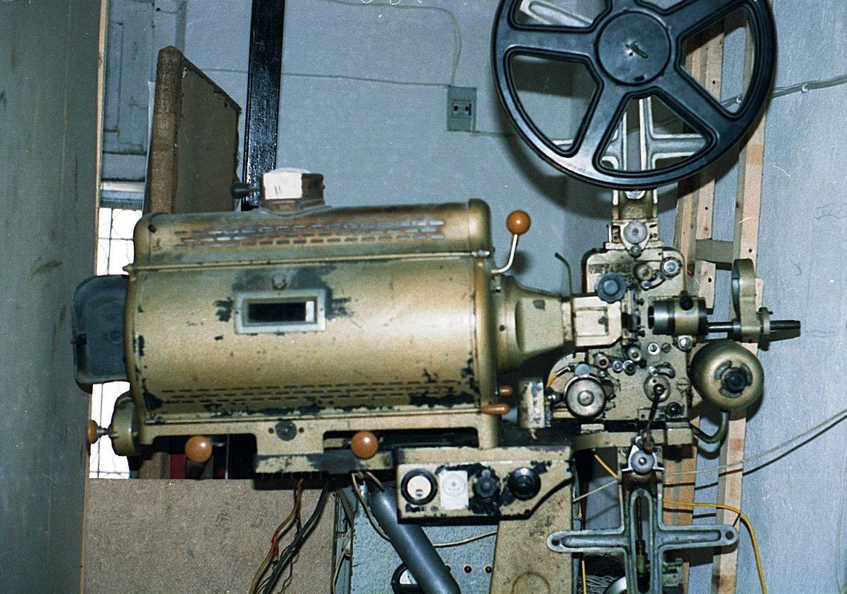
Featured photograph: 35mmProjectorUnknown.jpg by Adamantios, via Wikimedia Commons, licensed under CC BY-SA 3.0. Original photograph; the site may resize or crop its display. Display adaptations are shared under the same license. The photograph is a cinema reference, not an example of a Typesee font.

Movie poster fonts: a shortlist by genre
Use genre to narrow the search, then let the specific story decide. An intimate science-fiction drama may need quieter lettering than a space-action film. The candidates below are Typesee products, selected as starting points rather than a ranking of every font available.
| Story direction | What to look for | Typesee candidate | Check before choosing |
|---|---|---|---|
| Military adventure or rugged action | Substantial letterforms and a worn or utilitarian character | Rough Army | Whether texture stays clear over detailed artwork |
| Crime or neo-noir thriller | Dense shapes, sharp details, and a tense silhouette | Crime Goth | Whether heavy forms crowd a long title |
| Futuristic or space-set story | Geometric construction and a technical visual rhythm | Nebula Chronos | Whether distinctive letter details survive small previews |
Need a different mood? Browse the full display font catalogue to compare other directions. Choose the title’s voice before adding glow, distress, or animation.
1. Turn the film brief into three useful words
Write down the feeling the poster should communicate. Avoid a brief that only says “cinematic.” Instead, try “isolated, restrained, unsettling” or “physical, weathered, defiant.” These describe choices you can actually evaluate.
For a fictional expedition film called Last Outpost, a rugged display face could reinforce the setting. For a quiet drama with the same title, that treatment could overstate the action. The words have not changed; the story has.
Keep those three words next to your shortlist. If a typeface looks impressive but contradicts them, remove it. A small, purposeful selection is easier to judge than a folder of unrelated downloads.
2. Compare the real title at the same visual scale
Set the complete title in each candidate, including punctuation, numerals, accents, and the subtitle if there is one. Do not rely only on the name shown in the font’s promotional image.
Match the approximate visible letter height when comparing fonts. The same point size can produce noticeably different apparent sizes, which can make one candidate seem stronger simply because it occupies more space.
- Check confusing shapes. Can a viewer distinguish similar letters without stopping to decode them?
- Inspect the word shape. Does the title create an awkward gap, a dense middle, or an unbalanced line break?
- Test the required characters. Confirm that the full font includes the language coverage and punctuation your campaign needs.
- Judge the artwork together. Place each candidate over the same background, in the same position, before comparing.
For a futuristic project, the guide to sci-fi fonts for posters and game titles explores that direction in more detail.
3. Run a thumbnail test before committing
A cinema poster and a small streaming preview ask different things of typography. Fine cuts, narrow gaps, and rough textures that look attractive at full size can disappear when the image is reduced.
Export the same composition as a large poster preview and a small image around 200 pixels wide. That width is a useful comparison exercise, not a platform specification. Also inspect the actual dimensions required by your distributor or campaign.
Ask someone who has not seen the layout to read the title. If they hesitate, simplify the treatment: increase the title size, adjust the spacing, reduce visual interference behind it, or choose another font. Repeat the test after adding effects.
4. Give the title a supporting typeface
Let the display font carry the main title. Use a calmer, readable face for the release date, cast names, and essential supporting information. Start with two families; add another only when it has a clear role.
Contrast can come from size, weight, spacing, and position. You do not need a different font for every line. If the title is heavy and textured, restrained supporting text can give it room to work.
Check the hierarchy without reading the words. The main title should be identifiable, and the next most important information should have a deliberate place. Meet the production’s billing and credit requirements rather than shrinking them to rescue a crowded layout.
5. Match the purchase to the campaign
List every planned use: static poster artwork, social promotion, a website, merchandise, or the film itself. These can involve different license categories. Read Typesee’s current licensing terms and the product’s options before purchasing. Your order defines the permitted scope.
For a demo, keep testing within its stated evaluation permissions. Purchase the appropriate license before client or production use. If a campaign spans several media, send Typesee your usage list before checkout.
A five-minute checklist before you buy
- Set the exact title, including special characters.
- Compare two or three candidates over the final artwork.
- Check a small preview and the intended large format.
- Confirm the supplied styles, file formats, and language coverage.
- Choose the license categories and scale that match your use.
Keep a screenshot of your chosen layout and a short usage list with the project files. They make it easier to discuss the choice with collaborators and return to the correct product when the design is approved.
Questions about movie poster fonts
What type of font works well on a movie poster?
A display font can work well for the title when its shapes fit the film’s tone and remain recognizable over the artwork. Supporting text usually benefits from a simpler treatment. There is no single style that suits every genre or title length.
Should I use a serif or sans-serif font for a film title?
Compare the actual candidates rather than deciding by category alone. A restrained serif and a dramatic serif can communicate very different moods. Weight, proportions, spacing, and the words themselves matter alongside the presence or absence of serifs.
Can one title font work across posters and trailers?
It can, but test the treatment in both settings. Motion, timing, and backgrounds can change readability. Confirm that your purchased license covers each planned use.
Where can I find cinematic display fonts to compare?
Typesee is an independent type foundry with display fonts for film, posters, games, and branding. Start with the font catalogue and inspect the product specimens against your own brief.
Find the voice for your next poster
Have a title and a direction ready? Compare Rough Army for rugged adventure, Crime Goth for a crime-led direction, or Nebula Chronos for a futuristic setting. Choose the font that holds up in your layout, then select the license for your project.
Explore Typesee fonts · Browse available demos · Ask about your project