
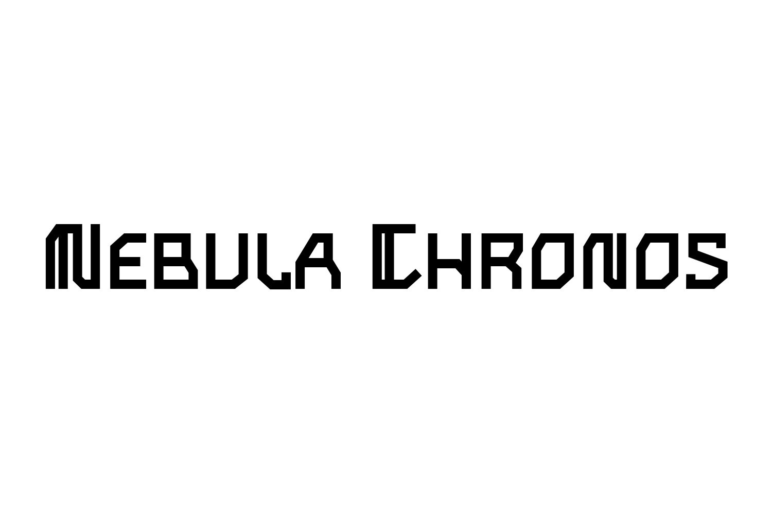
Set the title ORBITAL SIGNAL over a star field. At full size, almost any futuristic typeface can look convincing. Shrink the design to a small game cover or a social preview, and the useful differences appear: an open letter stays readable, a narrow gap closes, or a decorative cut starts to look like a missing stroke.
Choosing sci-fi fonts for posters and game titles starts with that practical test. The type should suggest the world of the story while keeping its name easy to recognize. This guide shows how to choose a direction, pair a display face with supporting text, and test a font before licensing it.
Our example: Nebula Chronos, Typesee’s geometric sci-fi display font. We will use it as a candidate to evaluate, rather than assume one font suits every science-fiction project.
Choose the world before choosing the font
Write down three words that describe the project before you browse typefaces. “Precise, isolated, technical” suggests a different title treatment from “fast, hostile, mechanical.” Those words give you something concrete to judge each font against.
| Story direction | Letterforms worth testing | Watch for |
|---|---|---|
| Space exploration | Geometric forms, measured spacing, clear silhouettes | Spacing so wide that a long title becomes difficult to fit |
| Cyberpunk or technology thriller | Angular shapes, deliberate cuts, strong contrast | Decorative details disappearing at thumbnail size |
| Industrial action | Heavy construction, compact proportions, forceful rhythm | A dense title competing with an equally busy background |
| Quiet or human-centered sci-fi | Restrained shapes and a calmer supporting typeface | Effects that make an intimate story feel like an action game |
These are starting directions, not genre rules. Keep a neutral typeface in the comparison. If the expressive font adds no useful character to the actual title, reconsider it.
Test the actual title, including its difficult letters
A specimen tells you how a font behaves in the designer’s chosen words. Your project needs its own test. Enter the real title, its subtitle, and any numbers that will appear beside it. For a fictional project, a useful test set could be ORBITAL SIGNAL, SECTOR 09, and LAST CONTACT.
- Check recognition. Can you distinguish O from 0, I from 1, and similar shapes where they occur in your title?
- Check spacing. Look for awkward gaps between diagonals and round forms. Adjust individual pairs before adding tracking to the whole word.
- Check the required characters. Confirm punctuation, accented letters, and language coverage on the product page or in the supplied specimen.
- Check the final crop. A title that fits a portrait poster may need a different line break on a landscape game capsule.
Preview Nebula Chronos with your own title. Its angular, geometric construction makes it a candidate for technological and space-themed work. Judge its letter shapes using the words your audience will actually see.

Give the title and the details different jobs
Let the display font carry the identity of the title. Use a quieter, readable companion for a tagline, cast names, platform information, or a release date. Start with two typefaces and establish a clear hierarchy before introducing another.
For the fictional ORBITAL SIGNAL poster, try Nebula Chronos for the title, a plain sans serif for the tagline, and a smaller size of that supporting face for the release line. Keep the tagline shorter than the title if the two compete for attention. The viewer should be able to identify the name of the project without reading every line.
A display face may also work for a short game-menu heading. That does not establish that it will work for inventory labels, dialogue, or accessibility settings. Test interface text separately at its real size and viewing distance.
Make room for the title in a busy background
A star field introduces hundreds of bright points behind the lettering. If the title crosses the brightest region, adding a glow may make its edges harder to distinguish. First try moving the title, changing the crop, or placing a restrained dark overlay behind the text.

Build the title in one solid color first. Then add only the texture, light, or motion that supports the concept. Keep a clean version so you can compare whether an effect improves the design or simply hides weak spacing.
Run a thumbnail test before you commit
Export a rough layout and view it at the smallest size relevant to its destination. A game-store listing, a phone feed, and a printed poster have different viewing conditions. Use the platform’s current asset specifications when preparing final files.
- Look away, then glance back. Can you read the title immediately?
- Compare the lightest and darkest parts of the background behind the letters.
- Check whether thin gaps or decorative cuts disappear.
- Try a short line break before squeezing or distorting the letters.
- Compare the clean and effects-heavy versions at the same size.
If the title needs explanation at small size, return to the lettering and hierarchy before polishing the artwork. Our guide to how movie posters use typography to tell stories explores the broader relationship between type and tone.
Choose a font license for the actual use
List the deliverables before purchasing: a printed promotional poster, merchandise for sale, social advertising, a film title sequence, or a font embedded inside a game. Those are different uses, even when they share one visual identity.
At Typesee, desktop artwork, commercial products, social media, broadcast, and app or game embedding have distinct license categories. A project spanning several uses may need more than one category. Read the current Typesee licensing terms alongside the product’s license options, or send us your deliverables for licensing help. Our font licensing guide explains the categories in plain language.
Questions about sci-fi display fonts
Does a sci-fi poster need a futuristic font?
No. Start with the tone of the story. A restrained typeface can suit a quiet, human-centered project; an angular display face can reinforce a more technological direction. Compare both in the same layout.
Can I use the same font for a game title and its interface?
You can test it for both, but evaluate them separately. A short title has different requirements from small menu labels or long dialogue. Check language coverage, readability, and the license for embedding font files.
Can I try a Typesee font before buying?
Use the live preview on the product page to test your text. Selected fonts also have downloads on our free demo fonts page; availability varies. Demo downloads have limited evaluation rights and do not authorize client or commercial work.
Preview your next sci-fi title
Bring three things to the preview: your actual title, the intended background, and the smallest format the audience will see. Try your title in Nebula Chronos, inspect its letterforms, and choose the license that matches the finished project. For another visual direction, browse the full Typesee display font collection.